
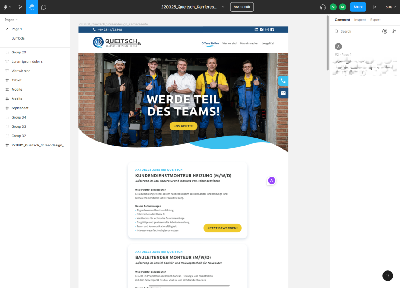
What is a style guide?
A style guide provides information about the corporate design of the company. This forms the basis for ensuring a uniform corporate identity across all media.
At the same time, a style guide speeds up the development process considerably, since a template no longer has to be created by a designer for every new combination of elements – predefined elements can usually be flexibly combined with each other.
It is important that the designers of the style guide also know the requirements and possibilities of web applications.

Differences Between Web vs. Print
The complexity of web applications compared to print products is remarkably different. Print media, be it business cards, stationery or magazines, are fixed, static formats. For example, a designer creates an A4 page that is then printed and remains unchangeable in its physical form. In contrast, a magazine does not change its size when you flip through it.
Websites, on the other hand, offer a more variable experience. They are accessed from a variety of devices with different screen sizes, resolutions and orientations. Especially on mobile devices such as smartphones and tablets, the view can change quickly by simply rotating the screen.
Technical barriers further add to the complexity. Depending on the browser, operating system, and screen type, different challenges may arise. Who doesn’t remember the challenges that Internet Explorer brought to web developers? Even today there are restrictions, for example by Apple. While some browsing features are available in the Safari browser on the Mac, they are missing on iOS devices like the iPhone or iPad.
Another element to consider is the representation of colors. With print media, it’s often a matter of getting the color saturation right. For websites, we have to take into account the varying display quality of end devices. A color contrast that looks brilliant on a designer’s premium monitor may look completely different on a standard office monitor. For example, some monitors can’t faithfully reproduce certain whites, which means a design that looks great on one device may be lost on another.
In short, while print designs have their own challenges, web development requires a deep understanding of a wider range of variables and potential obstacles.
Digital Design
The landscape of endpoints for web applications is extremely diverse. Responsive design, which automatically adapts website output to different screen sizes, is now standard.
Design professionals with a background in print face a change here: instead of pixel-precise specifications, general design principles are required. A style guide for web applications primarily defines a set of rules from which concrete designs can then be derived. Here, the designer can provide both the basic design and exemplary derivations. Such guides are often essential for developers and editors to maintain the desired design consensus.
Static design
At the dawn of the smartphone era, two versions of a website were often deployed: One for the desktop and one for mobile devices. One example is Spiegel Online, which offered a mobile variant via the subdomain m.spiegel.de. Although this method was suboptimal, it was used for many years. In view of the increasing number of different end devices, more flexible solutions were sought.
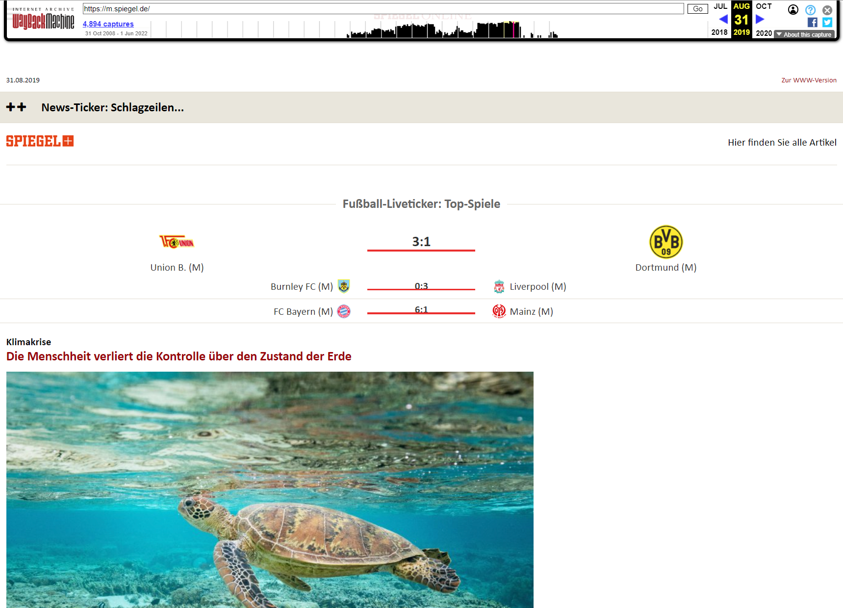
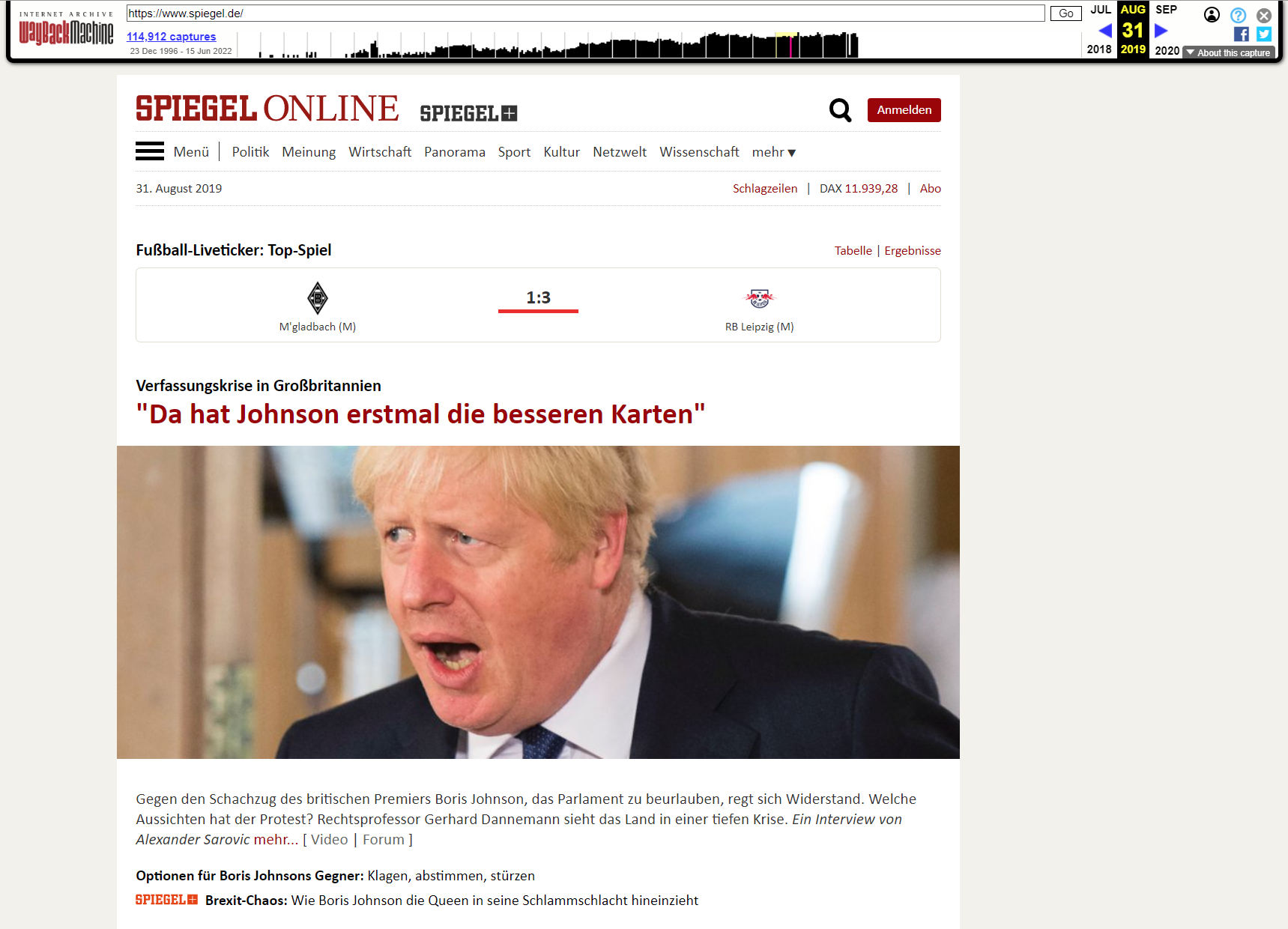
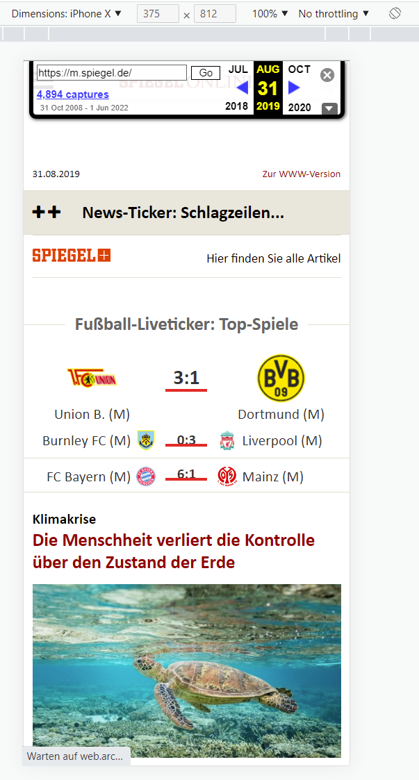
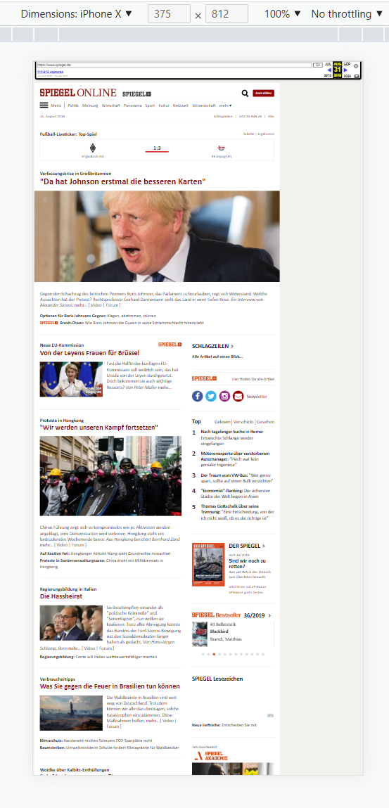
Spiegel Online August 2019 Mobile/Desktop version in mobile/desktop view. Classic: The link to the mobile version with its own subdomain.
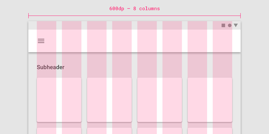
Grid-based design
The grid approach comes from print design and allows simple and structured layouting in columns and rows, similar to a table. In fact, in the past, websites were built mainly with tables, which led to very rigid behavior. A dynamic adaptation to mobile devices does not yet take place here.
Fluid Design
This approach adjusts the dimensions of the elements proportionally to the screen size. This works well as long as the screens are not too wide or too narrow – but smartphones in particular have extremely different widths and heights due to their narrow design and because they can be used both horizontally and vertically. A purely fluid design approach would thus lead to extremely wide or narrow columns or elements.
Responsive design
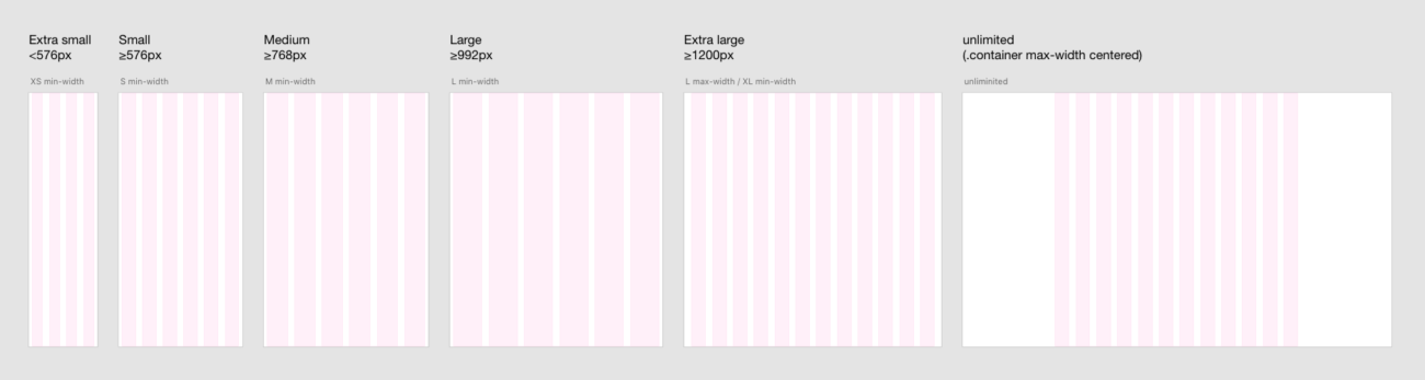
This is a collective term that combines all the techniques that optimally ensure the user experience on every device. Here, columns can be used for a grid view if the screen is large enough, otherwise the columns are fluidly reduced in size and broken into new rows from certain screen sizes (breakpoints).
Important here is the situational interaction of the available techniques and at the same time the usability for the content creator (editor). Ideally, there is a functioning standard behavior that can be flexibly adapted to individual elements in the event of borderline cases or special requests. There are many popular approaches to this, we present two here.
Column-based frameworks
Probably the most popular column-based framework is Bootstrap. In particular, these determine the responsive behavior of design elements through a technical concept. As a result, the development of websites could be massively accelerated. The approach was so successful that numerous designers now work according to Bootstrap’s 12-column grid.
However, column-based frameworks like Bootstrap have several drawbacks:
- These frameworks are often monolithic, i.e. not modular, and increase the overhead of a website, resulting in a worse PageSpeed .
- The number of possible columns is usually limited, for example with Bootstrap to 12 columns. This leads to limitations in the number of elements that can be displayed side by side when space is limited.
- Technically, there is a tendency towards a strong nesting of the HTML elements, which increases the complexity.
- In most cases, designers then deviate somewhat from the framework’s set of rules – this leads to enormous effort for what are actually trivial design elements, since they can no longer be implemented sensibly within the framework or it would sometimes lead to strong deviations from the design template.
Since the column-based approach is still based on the raster concept, one has a rule-based approach, but still historically derived from the raster concept of print design.
Block-based frameworks
Block-based layouting follows a modular, rule-based approach. Instead of global rules for a fixed grid, there are global rules for the behavior of elements, which here are called blocks. Each block has its own global rules, from which you can deviate individually. The behavior of elements is therefore inherited and can be overwritten individually.
Block-based frameworks, such as the WordPress Block Editor (Gutenberg), have some advantages:
- Due to the modular approach, the overhead is low and PageSpeed can be correspondingly high.
- There is no limit to the number of columns.
- Nesting can also be useful here, but is less frequent and less necessary.
- Each block basically works stably and reliably according to the global rules first – deviations can be defined for individual blocks or block groups as special rules.
Since everything no longer has to be mapped in a grid, elements can break out much more easily – for example, be arbitrarily wider than the normal text width and no longer only within specified columns.
An element receives the instruction how wide it may become at most – for example 1300 pixels or 100%. If the screen of the end device is wider, the element will never be larger than the defined maximum width. If the screen is smaller, the element width is reduced accordingly.
This means that a designer can specify a group with the maximum default width in the block-based layout. These are reduced in size and break responsively when using columns depending on the breakpoint reached. The next block group can have a completely different maximum width. These then override the globally defined maximum default width. For continuous texts, for example, a maximum width of 800 pixels could be more suitable for the improved reading flow.
The global rules and special rules are ideally defined by the designer in cooperation with the developers – in a style guide. So it is clear which standard widths there are, at which breakpoints should be broken, etc.
Recommendation for responsive designs
Static, purely grid-based or fluid design approaches do not meet today’s quality standards in web design. Especially when a design provides for specific special behavior for individual elements (logic deviations), a column-based framework reaches its limits.
As a rule, clients, designers and developers have a common goal: The design idea should be implemented as precisely as possible, but flexibly on a website. This balancing act succeeds by gaining control on the one hand and giving it up elsewhere.
Pixel-perfect layouting of all elements is not the goal, as this would require an infinite number of special rules – instead, the goal is to achieve a logically consistent and visually appealing dynamic behavior of the elements.
The block-based approach does not try to define a grid that is valid for the entire website, but specifies a default behavior from which ideally individually for each block can be broken out at any time. However, especially in the design process, this requires that global rules of conduct are defined instead of global grids .

Requirements Styleguide
An element is repositioned faster in design tools, in grouped and responsive optimized elements on a website. An incomplete, incorrect or inconsistent style guide regularly leads to delays and errors in the technical implementation. A good style guide saves noticeably effort in the implementation.
Software
In earlier times, but partly still today, we receive design templates in the formats Photoshop, PDF, Powerpoint or Indesign.
The disadvantage of these formats is that they are not designed for the requirements on the web. Information important to developers is missing, unreadable, or misrepresented.
Therefore, use modern collaboration tools such as Adobe XD, Figma or Zeplin for style guides.
Content
Standard elements are configured globally and should therefore be defined centrally in a style guide, ideally for 3 breakpoints (desktop, tablet, mobile).
- Breakpoints
- Our WordPress theme offers 7 configurable breakpoints: Mobile (Portrait & Landscape), Tablet (Portrait & Landscape), Tablet Pro (Portrait & Landscape) and Desktop
- Colors incl. Designation
- Verwendete Schriftarten & Schnitte
- For maximum PageSpeed, no more than 3-4 font cuts should be used – cumulatively across all web fonts.
- Typography
- Continuous text, headings (H1-H6), links, etc.
- Font, line height, colors, etc.
- Buttons
- Form elements incl. Sample
- Vertical distances of the elements to each other (margins)
- Horizontal distances, e.B. for gaps
- Style patterns, such as .B box shadows
- Standard widths: text, wide width, etc.
- Hover effects
Requirements Styleguide
An element is repositioned faster in design tools, in grouped and responsive optimized elements on a website. An incomplete, incorrect or inconsistent style guide regularly leads to delays and errors in the technical implementation. A good style guide saves noticeably effort in the implementation.
Project
Each page needs its own workspace.
The design of the start page should therefore represent its own document, a subpage again its own. This reduces the confusion in the project as to which design is actually needed for a task. Likewise, the operation in the design tools is easier.
Developers love agile development, but subsequent – especially uncommunicated – changes to designs cause developers to start doubting themselves. It is unclear whether deviations were a bug or a hidden design update. Designs should therefore be final, subsequent changes must be communicated in detail.
Comments and annotations should preferably not be included in the design, but in a separate description for the task. This ensures that the developer does not overlook any hints.
In particular, deviations from the design specification should not be deposited in writing, but solved by a correction of the design.
Ideally, the desired result is revealed just by looking at the design – logic descriptions for functions (e.g. animations, sliders) are then found in the task description.
As developers, we need to recognize whether an element has a certain maximum width or actually occupies the full width of the screen. Therefore, use a canvas size of Full-HD (1920px width) and e.g. a maximum element width of 1440px. We then interpret surfaces that reach up to the horizontal edge as horizontal screen-filling.
Element structure
Pay attention to stringent construction.
If element groups have a different order depending on the responsive level, this can lead to high additional efforts. If an image group is displayed mobile as a slider and on desktop in columns, the technical solution is completely different.
When reviewing your designs, we will therefore always discuss such elements with you separately to identify effort drivers – it is best to avoid such element groups where possible.
Be sure to nest element groups in such a way that we can continue to read the spacing of the individual elements and the group.
Line Thicknesses
Line thicknesses should always be whole pixels. Sub-sizes such as 0.5 or 1.5px lead to unexpected results in the different browsers.
Assets
We need all images and graphics as downloads within the design collaboration software used. Ideally as a central media library as well as directly downloadable within the individual designs.
Images should be included in high resolution as PNG or JPGs. The optimization of the file size and compression is usually carried out automatically by us as part of the implementation.
Illustrations, graphics and icons that are suitable for vectors should be included as SVGs – please do not hide bitmaps base64-encoded in the SVGs. Ideally, you have already web-optimized the SVGs in file size.
SVGs, especially those with fonts, must be converted to paths and grouped and must not contain embeds.
Please provide fonts as woff2, other formats are no longer up-to-date. Google Fonts usually work very well, so it is enough for us to specify the fonts and cuts and we obtain the necessary font files ourselves.
Videos should be delivered as web-optimized mp4.
For PageSpeed reasons, we do not use icon fonts, such as Font Awesome, but SVGs for icons. Font Awesome or Iconmonstr provide the corresponding SVGs as downloads.
Please normalize the sizes of the assets. Icons should have the same dimensions, as should images and videos. In this way, we avoid subsequent adjustment requests or time-consuming special rules in programming.
result
We love good style guides. These are the visualization of your vision and lead to an excellent technical implementation.
Often, creating a technical concept for a web application or technology testing a website requires a design template to see how the frontend should look and behave in the first place. This is the only way to assess expenses well.
The more complete and stringent the style guide and designs, the more likely it is that patterns, i.e. repetitive element types, can be recognized and taken into account in development.
As a customer, you benefit from lower costs in technical implementation and subsequent maintenance as well as better editorial usability.
Our recommendation
Use the power of the block-based design approach to optimize your design ideas to the requirements of optimal responsive designs. Involve us at an early stage so that we can give feedback on style guides and designs at the beginning of the design implementation.